Data Visualisation Literacy
Understanding data visualisations is assumed. Rarely taught. This workshop gives your team the skills to read charts critically, spot misleading data, and ask the right questions.
Practical Microsoft and data skills training for the people who already use the tools.
A free 30-minute in-person or online session on reading and interpreting charts and data. A practical taster for your team, with no obligation to go further. Get in touch to book.

Understanding data visualisations is assumed. Rarely taught. This workshop gives your team the skills to read charts critically, spot misleading data, and ask the right questions.
Most people learn Excel on the job — and develop a quiet collection of worst practices: files only the creator understands, formulas avoided in favour of typing, and a powerful tool used at a fraction of its potential.
This workshop builds the foundations: the functions worth knowing, practices that keep files consistent, and habits that make your team's spreadsheets compatible with each other.
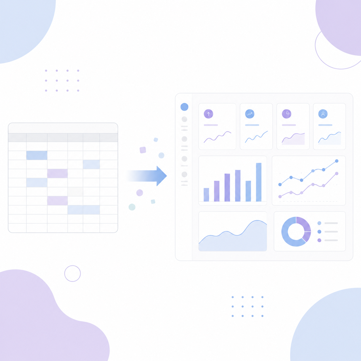
Power BI is what happens when Excel's analytical power meets proper data visualisation. For anyone comfortable with Excel functions, the jump to Power BI is smaller than you think — and the results are incomparably more powerful. In this workshop, learn how to get set up for that transition and where to go from there.